Map Projections
Map Projections
How can you represent the Earth or the skies on a flat sheet of paper? This has been a constant challenge for mapmakers over the centuries.
A map projection refers to how the globe is ‘projected’ onto a plane. It involves making decisions about what to include, and how to visually present information. It also means distorting the actual shape of the Earth. Projections often reflect the interests of their maker or patron. For example, putting a specific region at the centre of a world map highlights its importance. And sometimes great mapmakers wanted to pay homage to an earlier mapmaker by adopting their projection.
Here is a brief overview of some of the most prominent map projections in The Sunderland Collection.
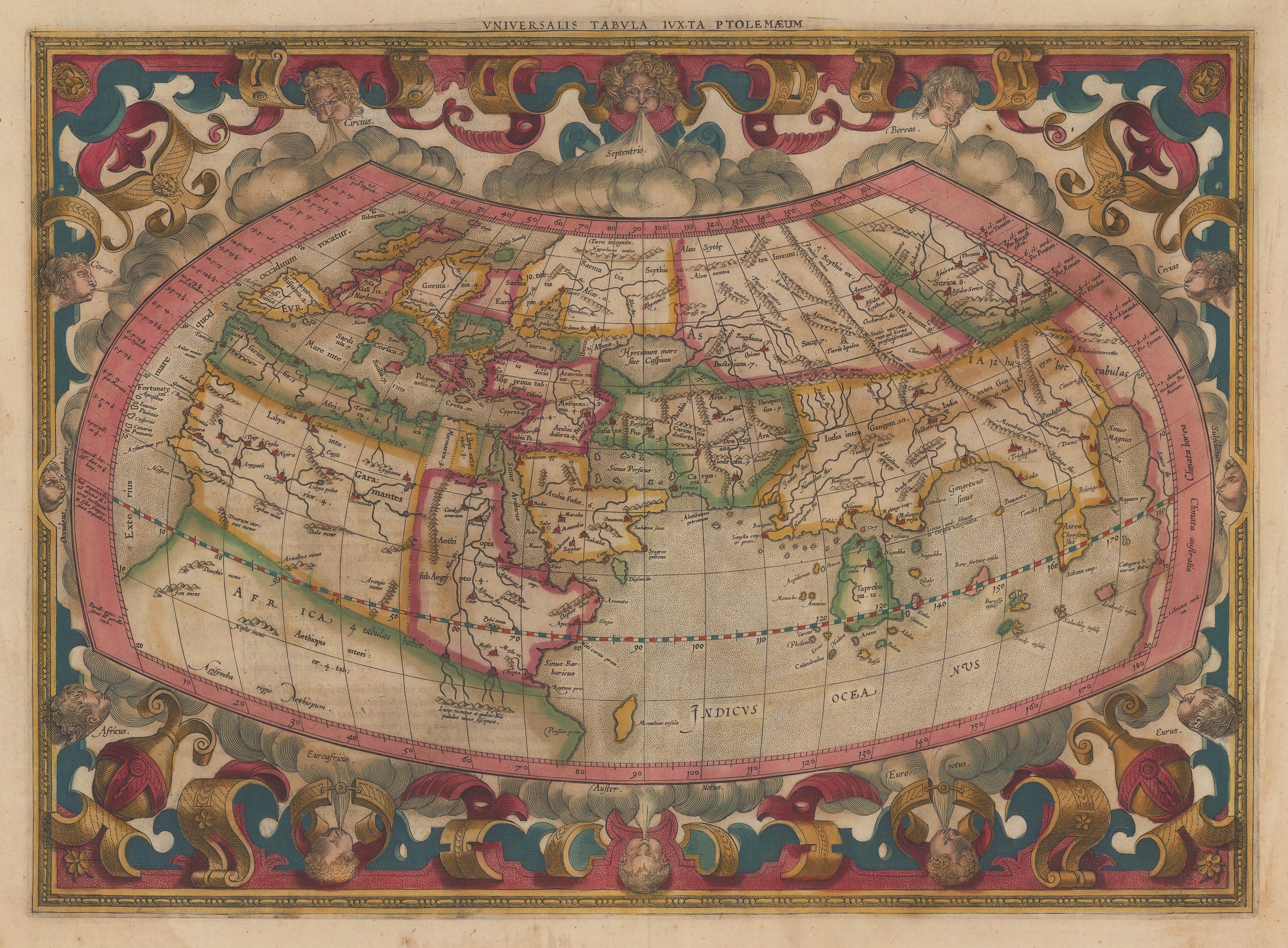
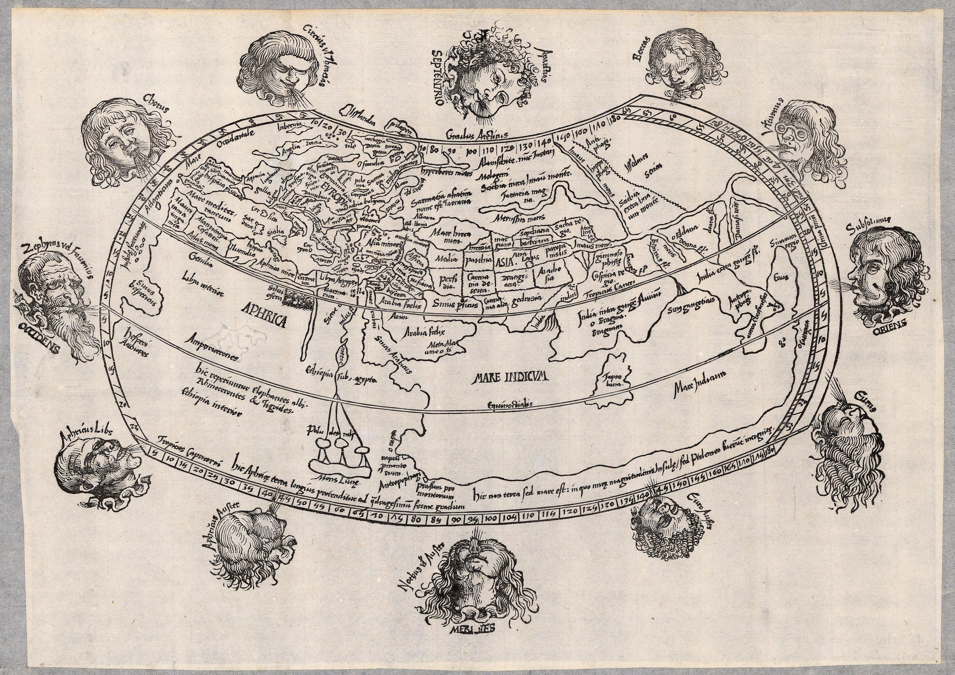
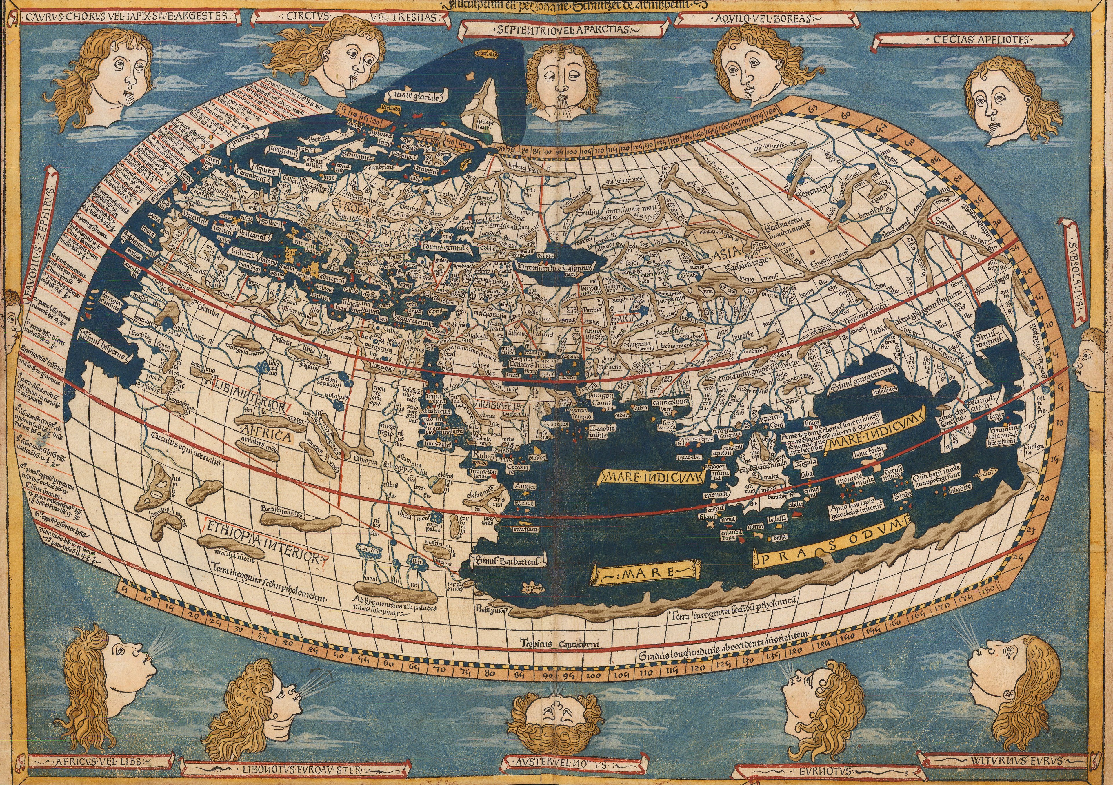
Ptolemaic
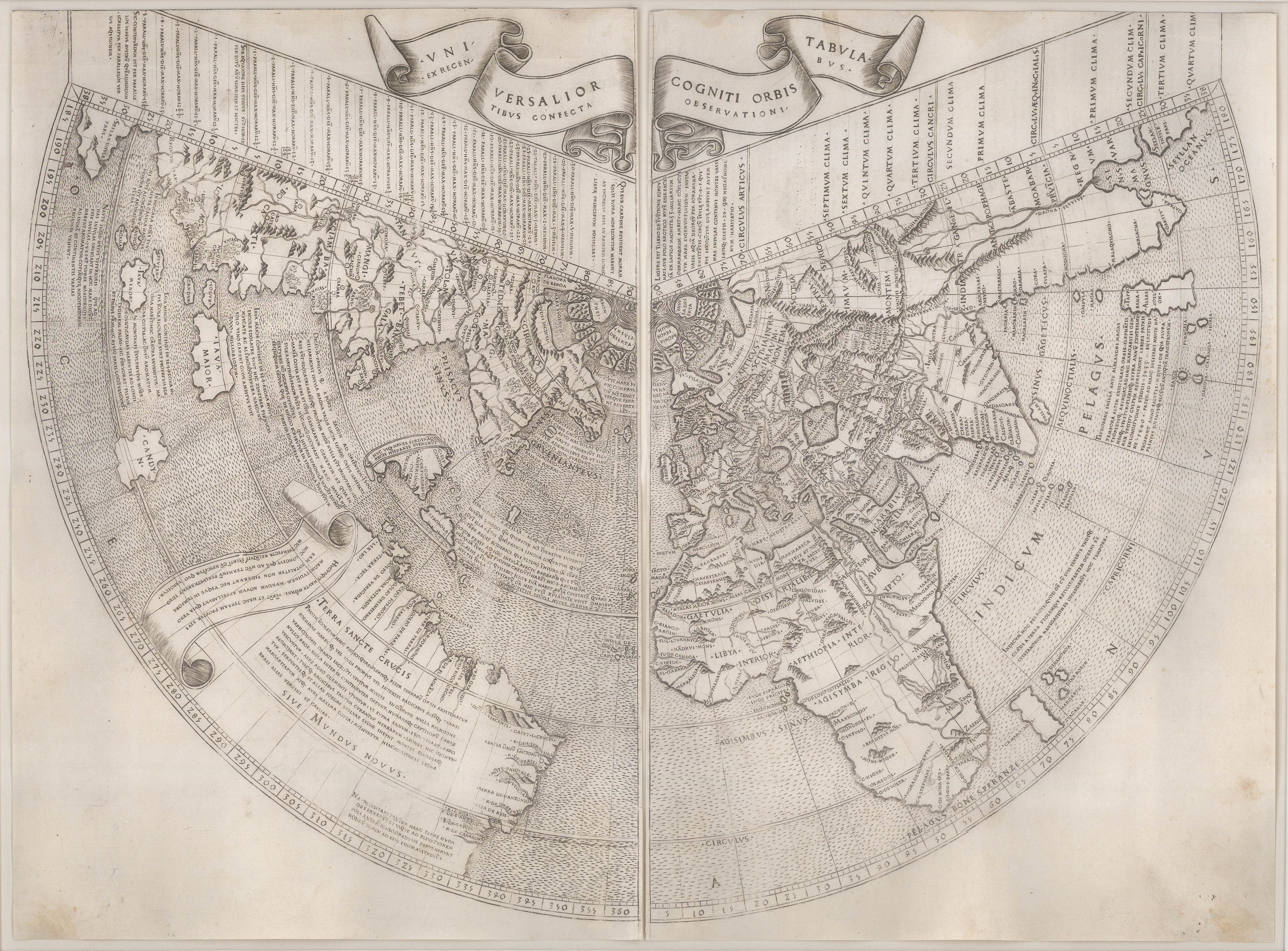
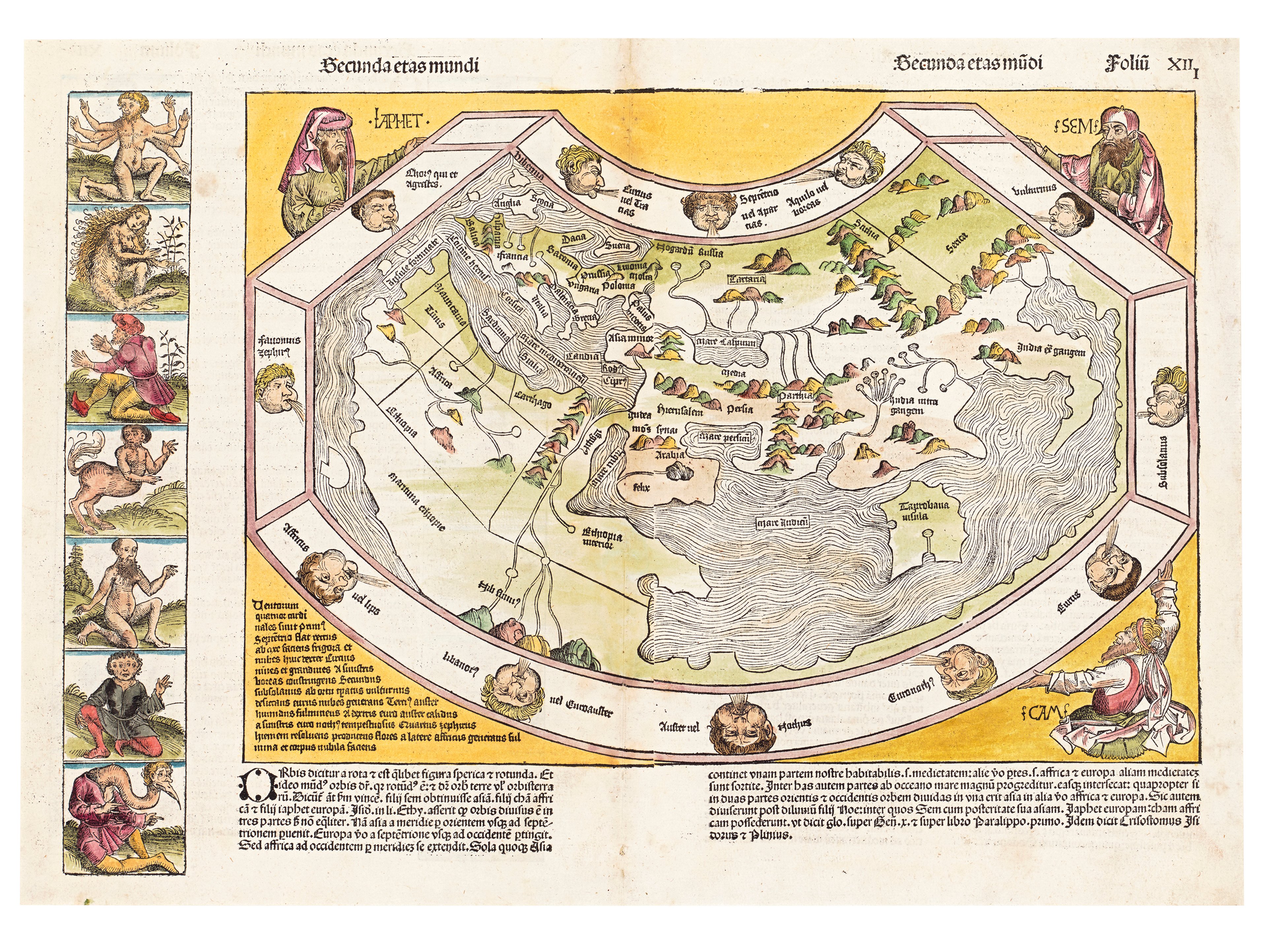
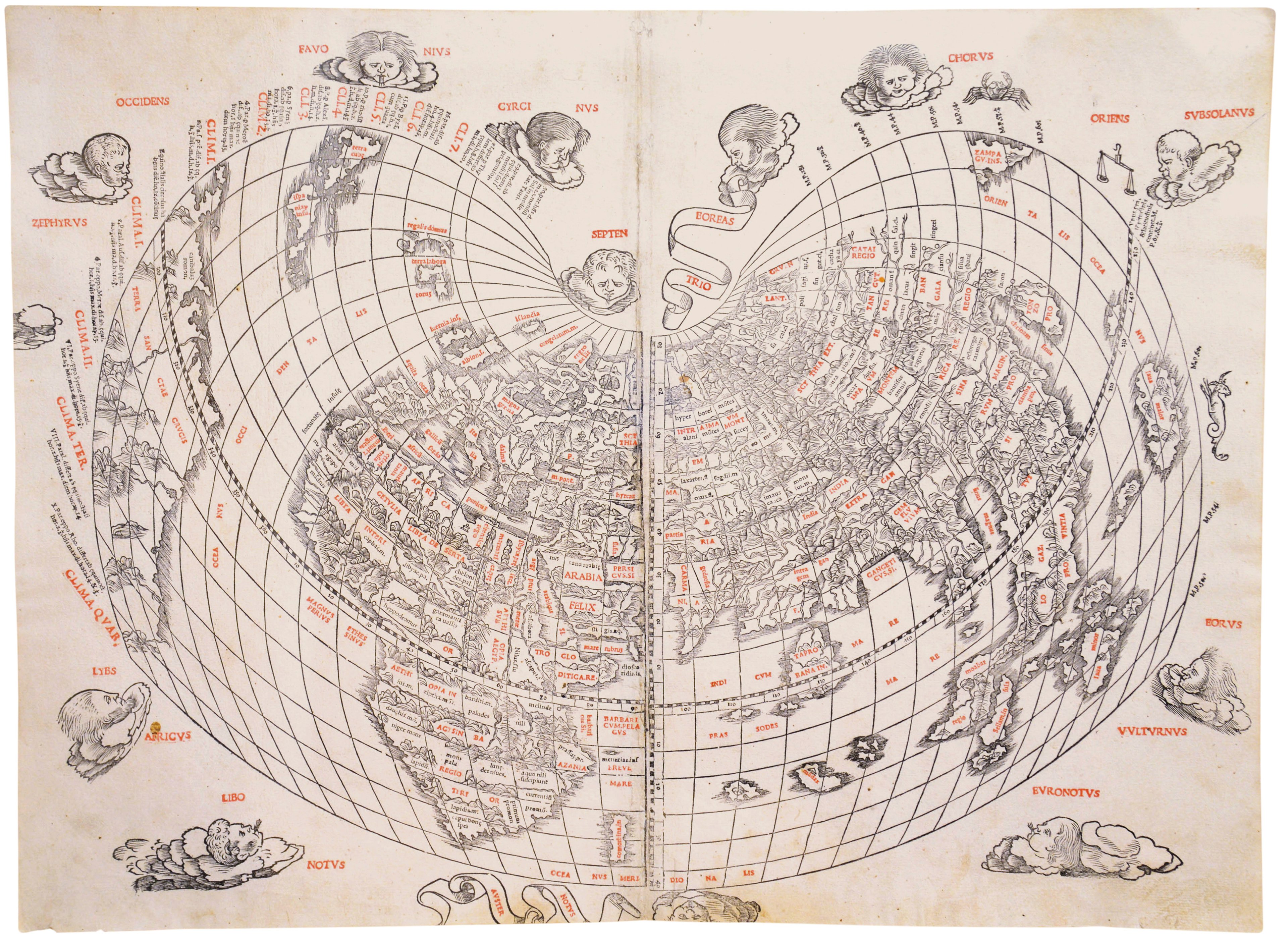
Named after Claudius Ptolemy, this projection was described in his ancient text the Geographia (c. 150 CE), and given form by the philosopher, Agathodaemon of Alexandria. The maps using Ptolemy’s projection were the first to include lines of latitude. They present the ‘known world’ made up of three continents: Asia, Africa, and Europe. There are two variations of the Ptolemaic projection.

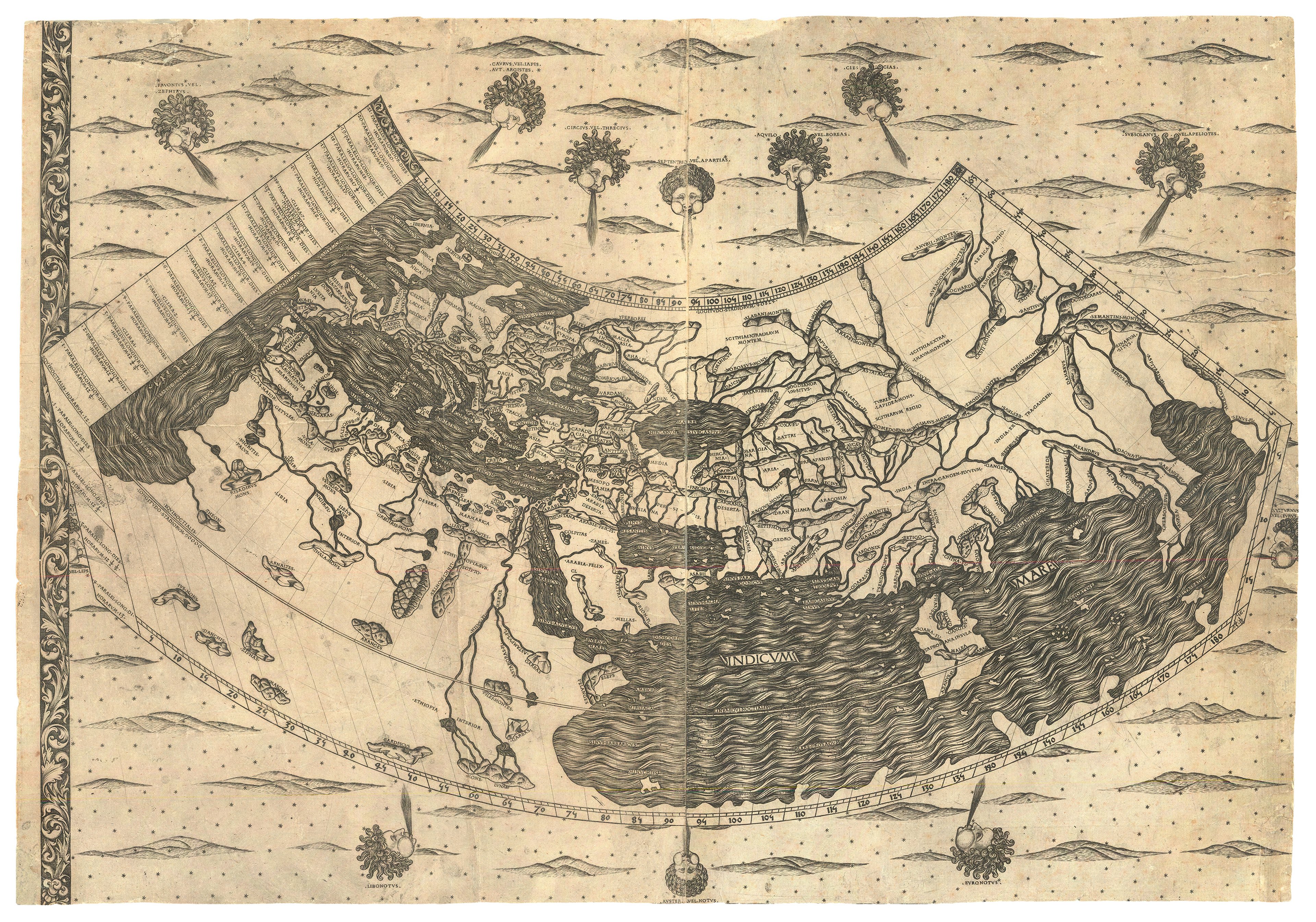
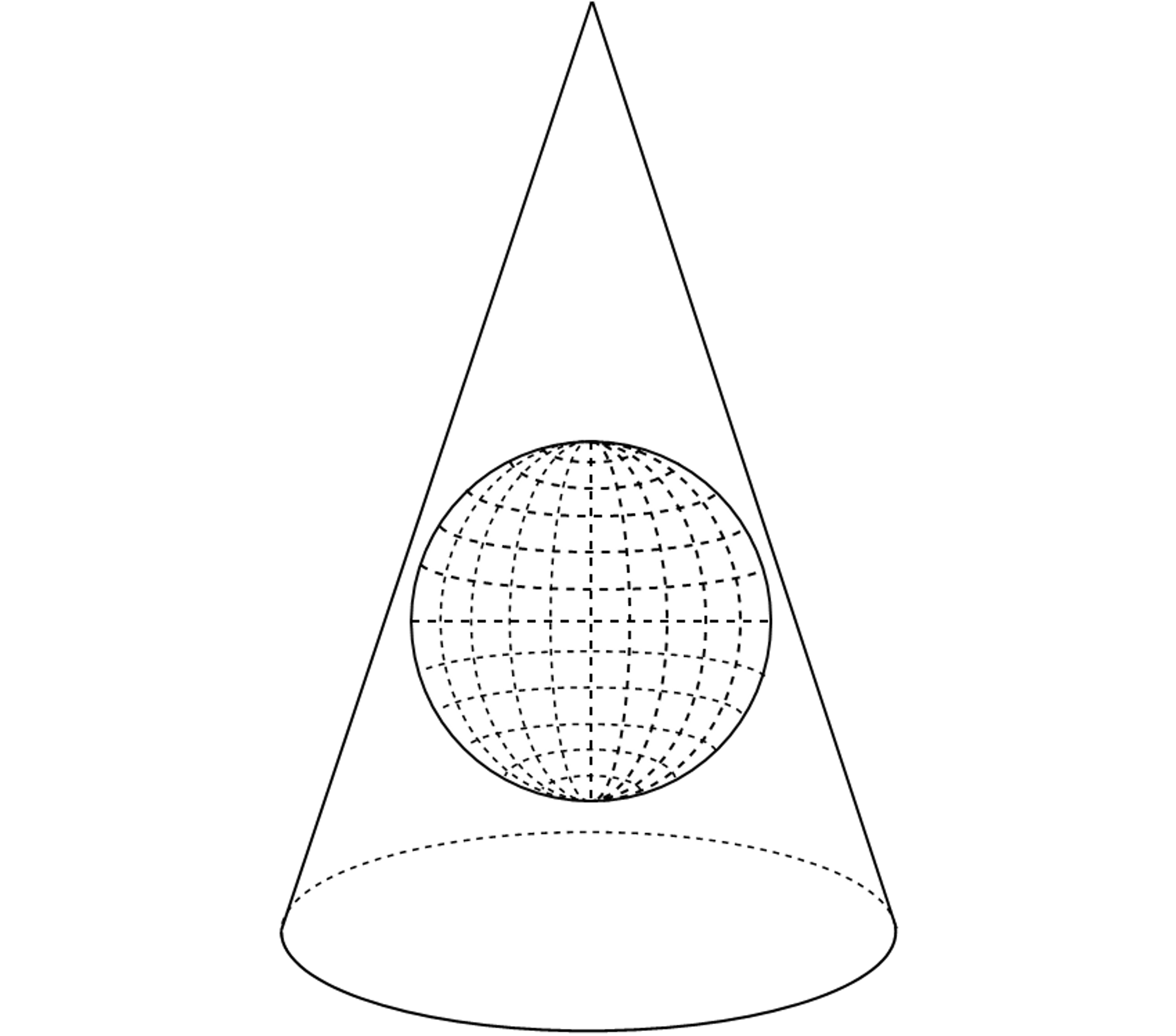
Ptolemy’s First Projection: Conic
In a conic projection, straightlines of longitude converge at a single point above the North Pole. If the map were rolled up, it would create a cone.


Second Projection: Homeotheric
Ptolemy’s second projection has rounded edges. The lines of longitude curve inwards, making this projection far more complex to draw.
Examples of Ptolemy’s second projection in collection include: Gerard Mercator’s Universalis Tabula Iuxta Ptolemaeum, Francesco Berlinghieri’s Caelestem Hic Terram Inspicias Terrestre Que Caleum, and Gregor Reisch’s Margarita Philasophica Ptolemaic world map.

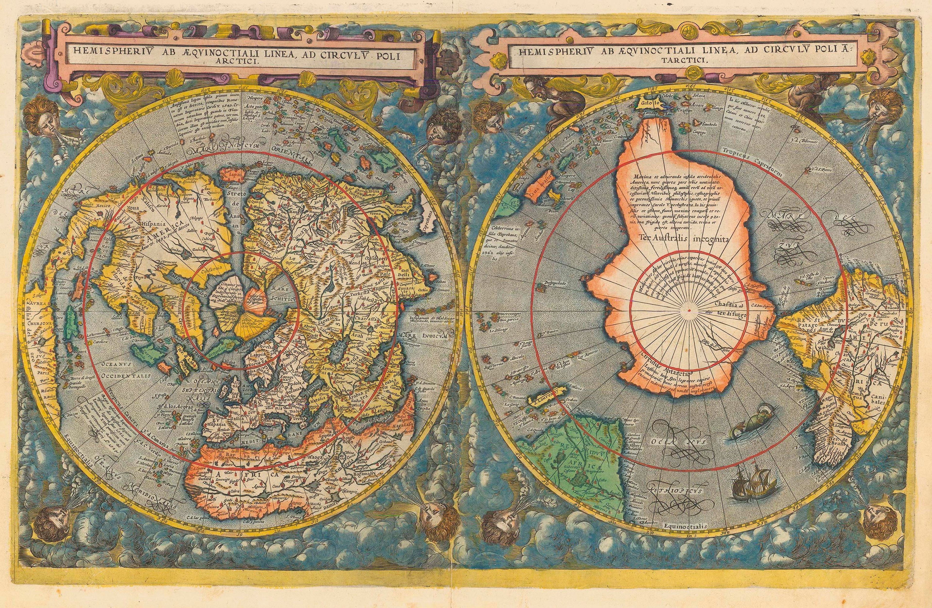
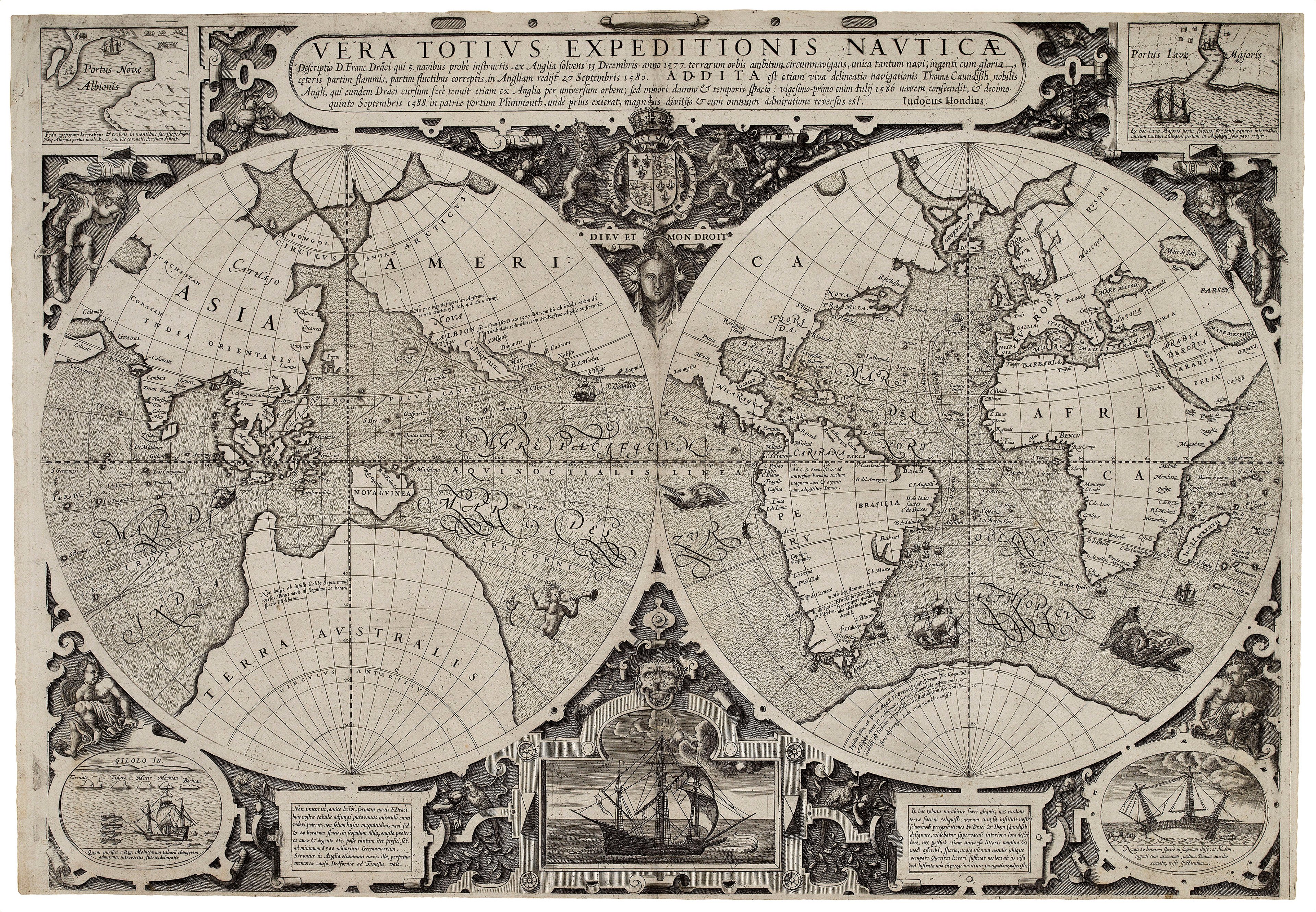
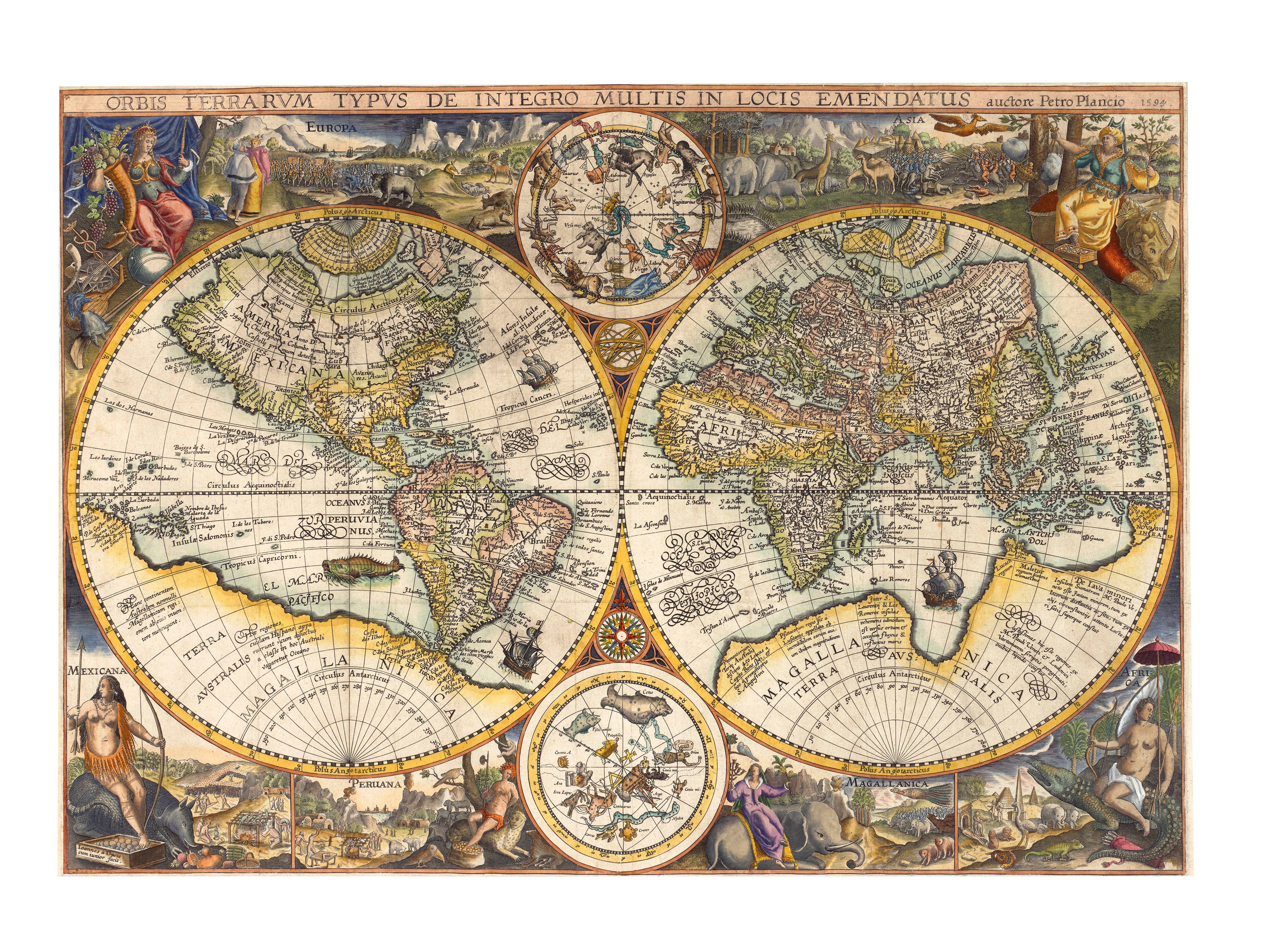
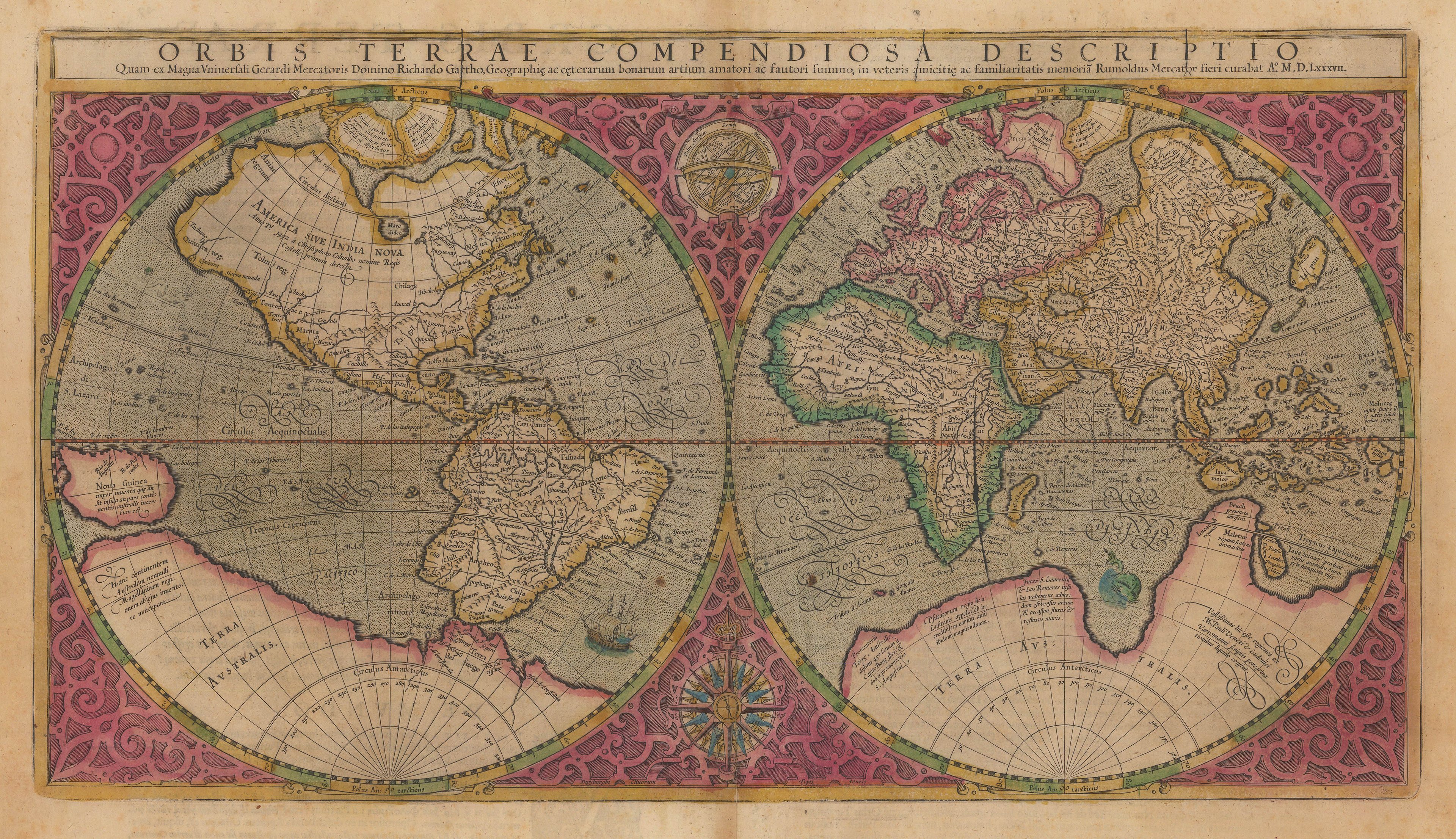
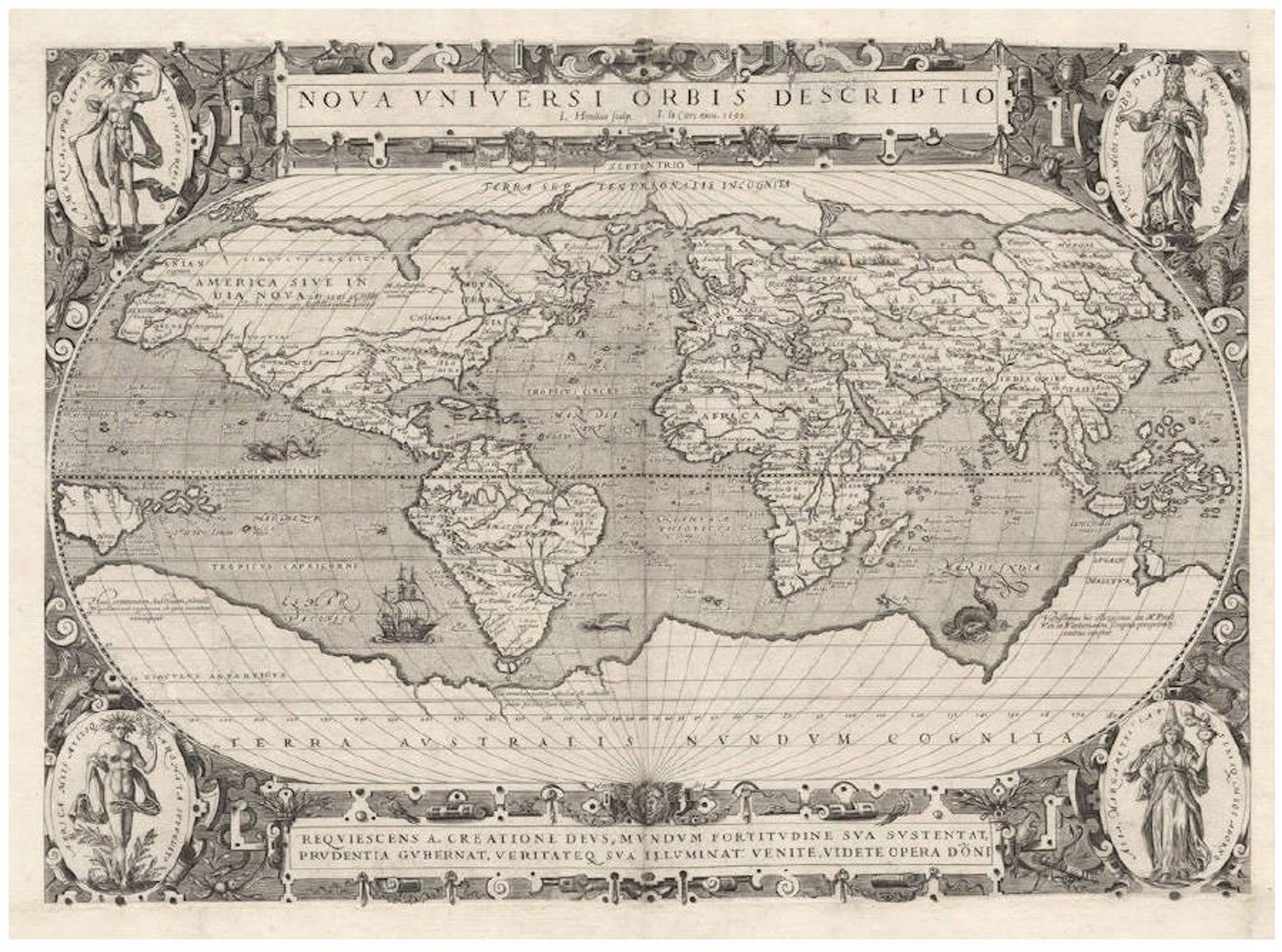
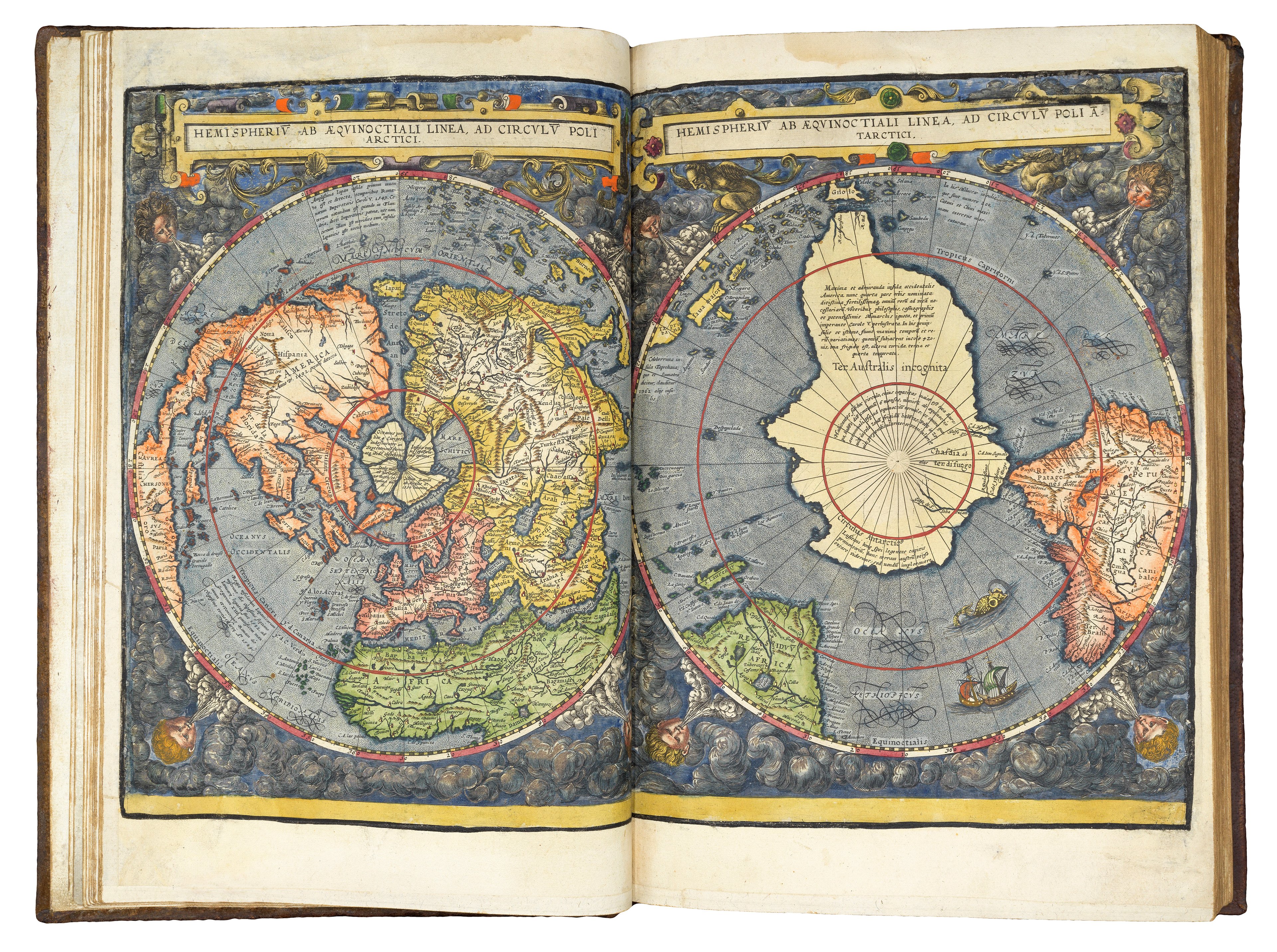
Double Hemisphere
Originating in the 16th century, this projection was introduced by Rumold Mercator. It typically shows the West and East hemispheres of the Earth, but also comes in North-South variations. The hemispheres are presented as two disks side by side. The lines of longitude are curved and meet at each pole.
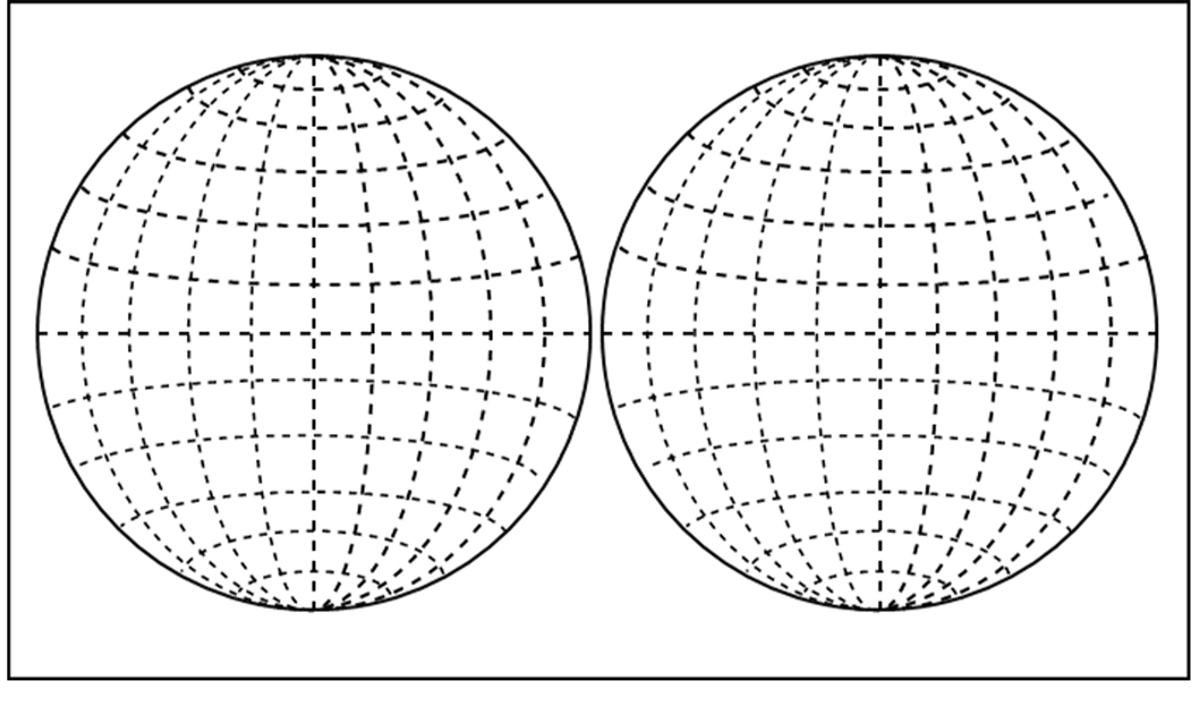
Double hemisphere maps are visually appealing: using two disks leaves space for ornamental border designs.
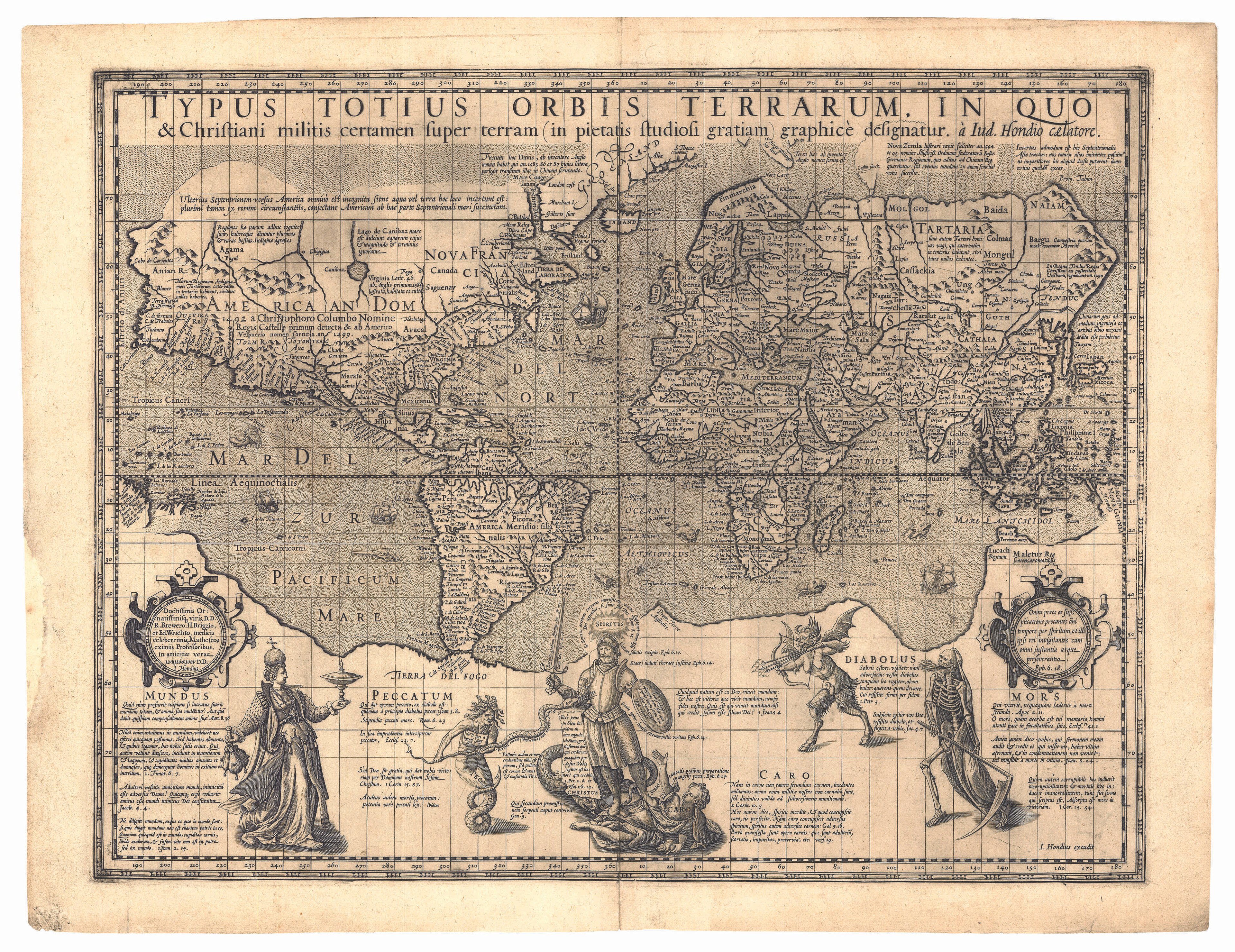
Mercator
This projection was named after the legendary mapmaker Gerard Mercator. It is a type of cylindrical projection: the globe is ‘unfurled’ into the curved face of a cylinder. As a result, the lines of longitude and latitude are straight and appear as a uniform grid. This means that the scale of objects in the map increases towards the edge: countries near the equator are consistently sized but objects further away are magnified.
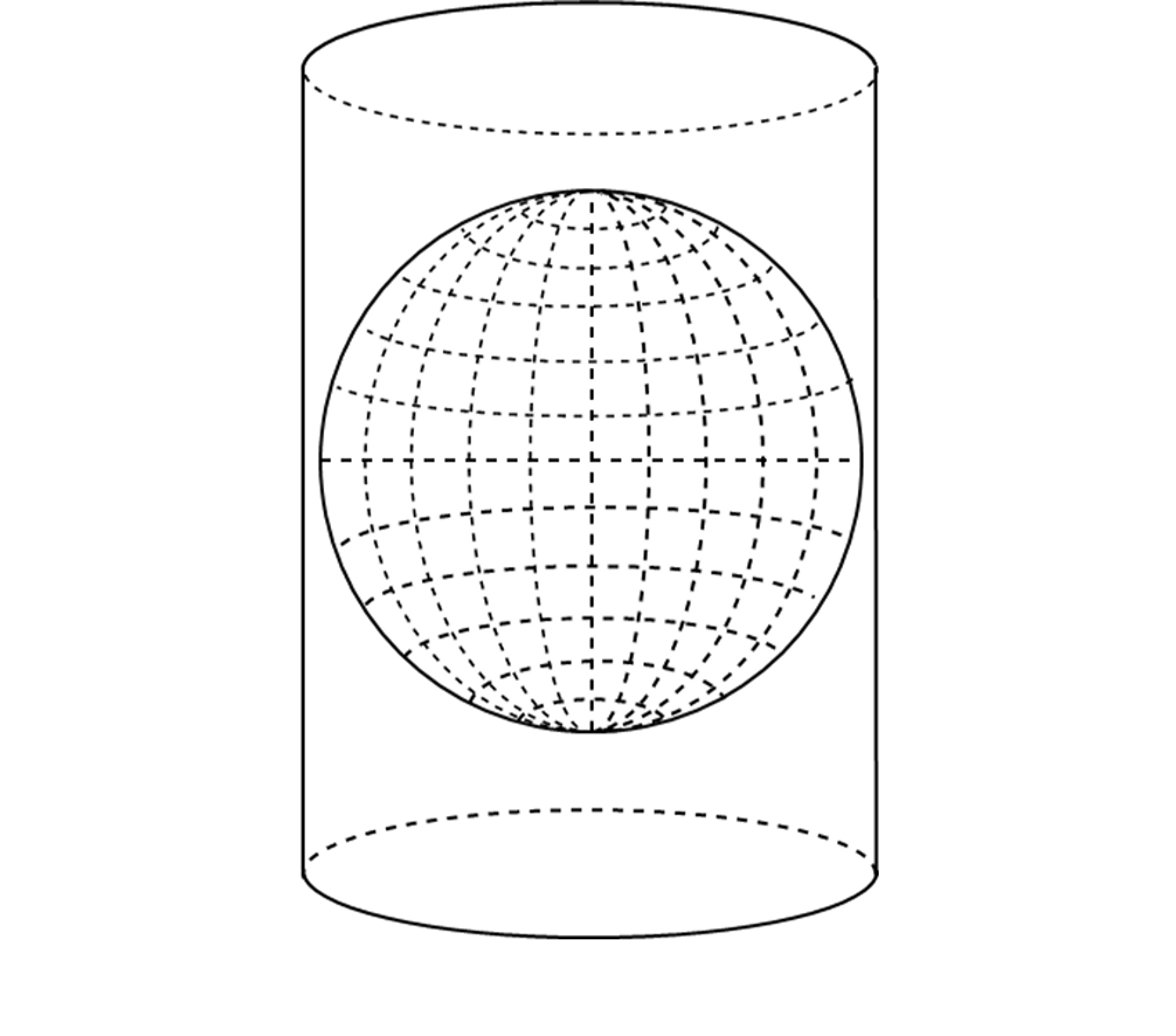
The Mercator projection was very useful for navigators because the grid lines made it easy to plan out voyages. Its popularity increased during the 19th century, and it became the standard choice for all educational maps. However, by the 1940s, this projection fell out of favour because of the distortions it contains.

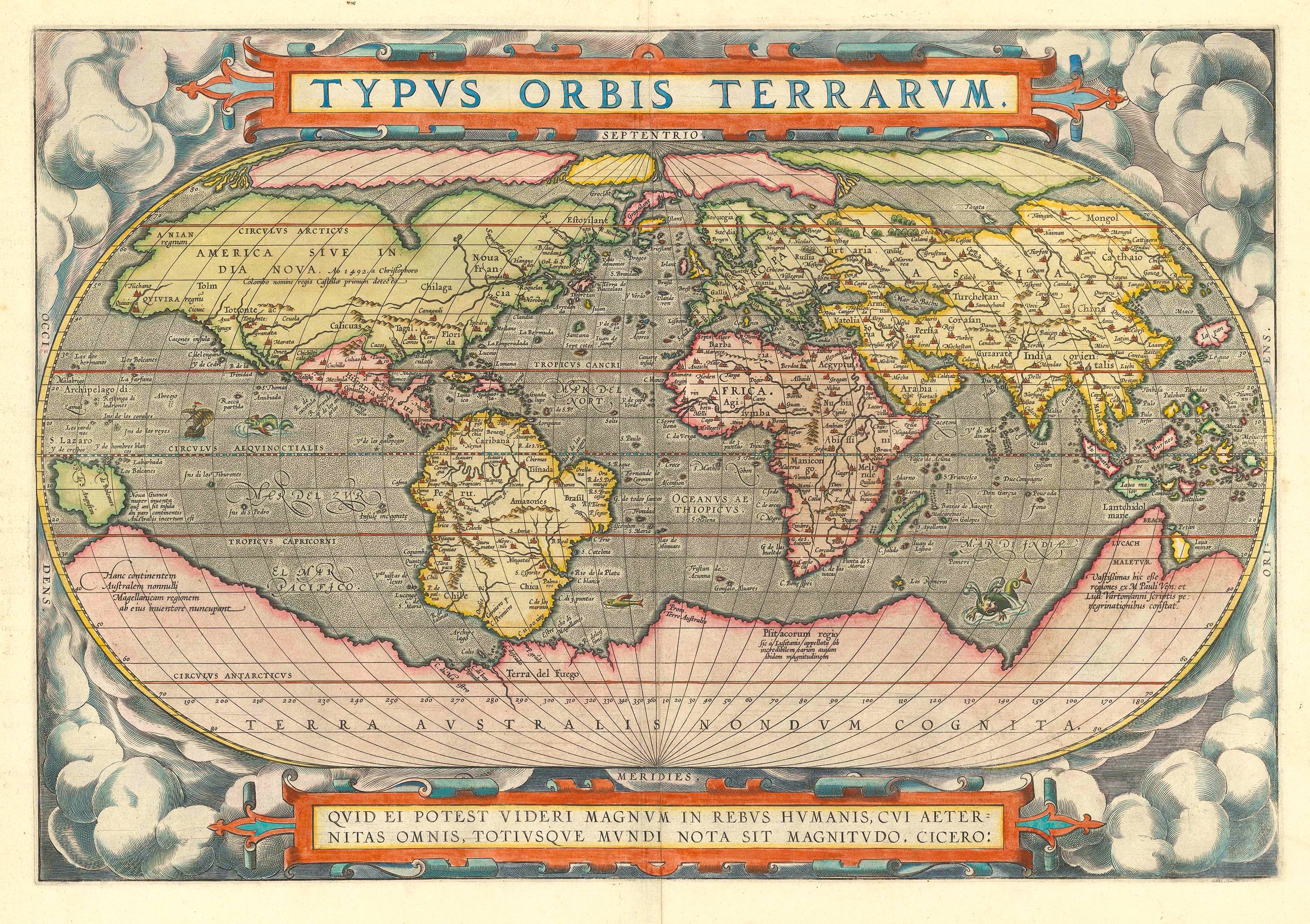
Ortelius Oval
The highly influential 16th century cartographer Abraham Ortelius used this projection in his 1570 atlas, Typus Orbis Terrarum. The atlas was extremely popular — 24 editions were printed in Ortelius’ lifetime alone. However, although this projection is named after Ortelius, it was first used by Battista Agnese 30 earlier. The form of the world’s hemispheres also reflects the first projection used by Petrus Apianus, another famour mapmaker, in 1524.

The Ortelius oval projection transforms the globe into stretched-out oval with flat poles. The equator and central meridian lines remain straight, whilst the other lines of longitude curve outwards and therefore get longer towards the edge of the map. Like the double hemisphere projection, the oval projection provides space for the borders to be filled with decoration and inscriptions.
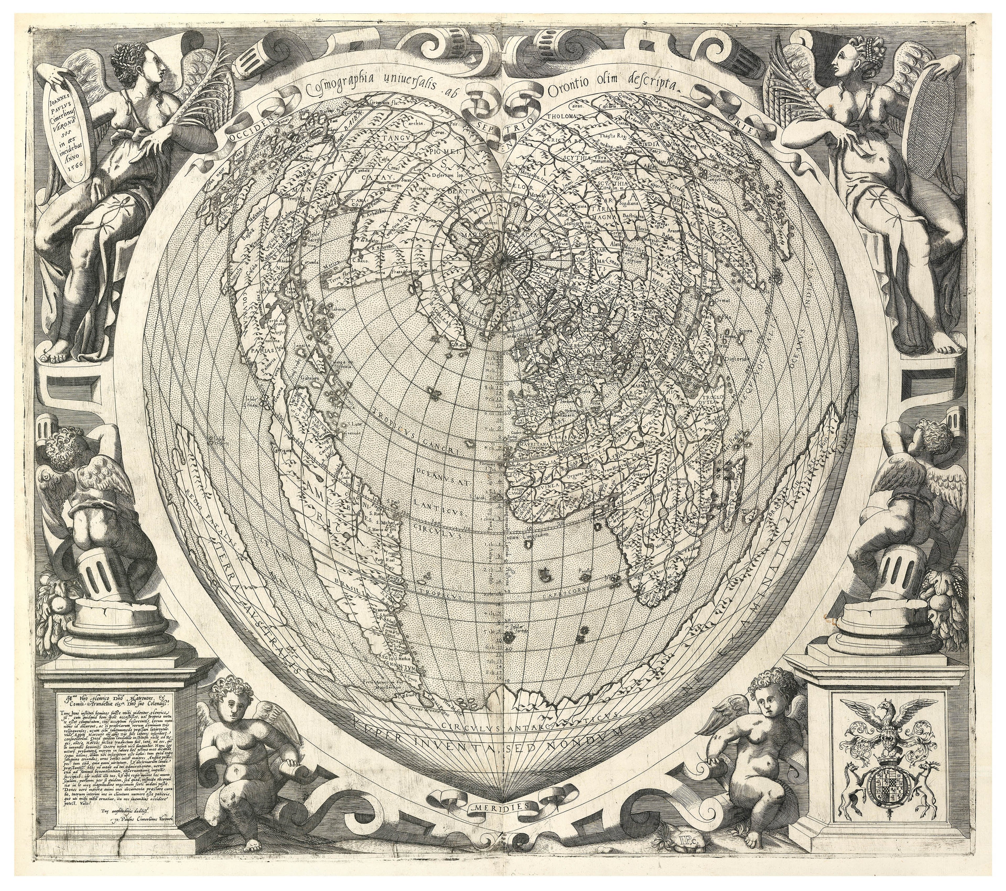
Cordiform
Cordiform projections warp the Earth into a heart shape. Their name comes from the Latin word ‘cor’, meaning heart. The astronomer, Johannes Stabius developed the projection in c.1500. It was used by various famous mapmakers thereafter, including Gerardus Mercator, Oronce Fine, and Abraham Ortelius.

The cordiform projection also carries symbolic meaning. The map mirrors the heart, of one of the body’s most vital organs, demonstrating the Earth’s significance as the heart of the cosmos. It also alludes to the philosophy of humanism, which centres on the agency of people rather than gods.
There are many variations of this projection, such as the double cordiform, showing the world divided into two heart shaped hemispheres.

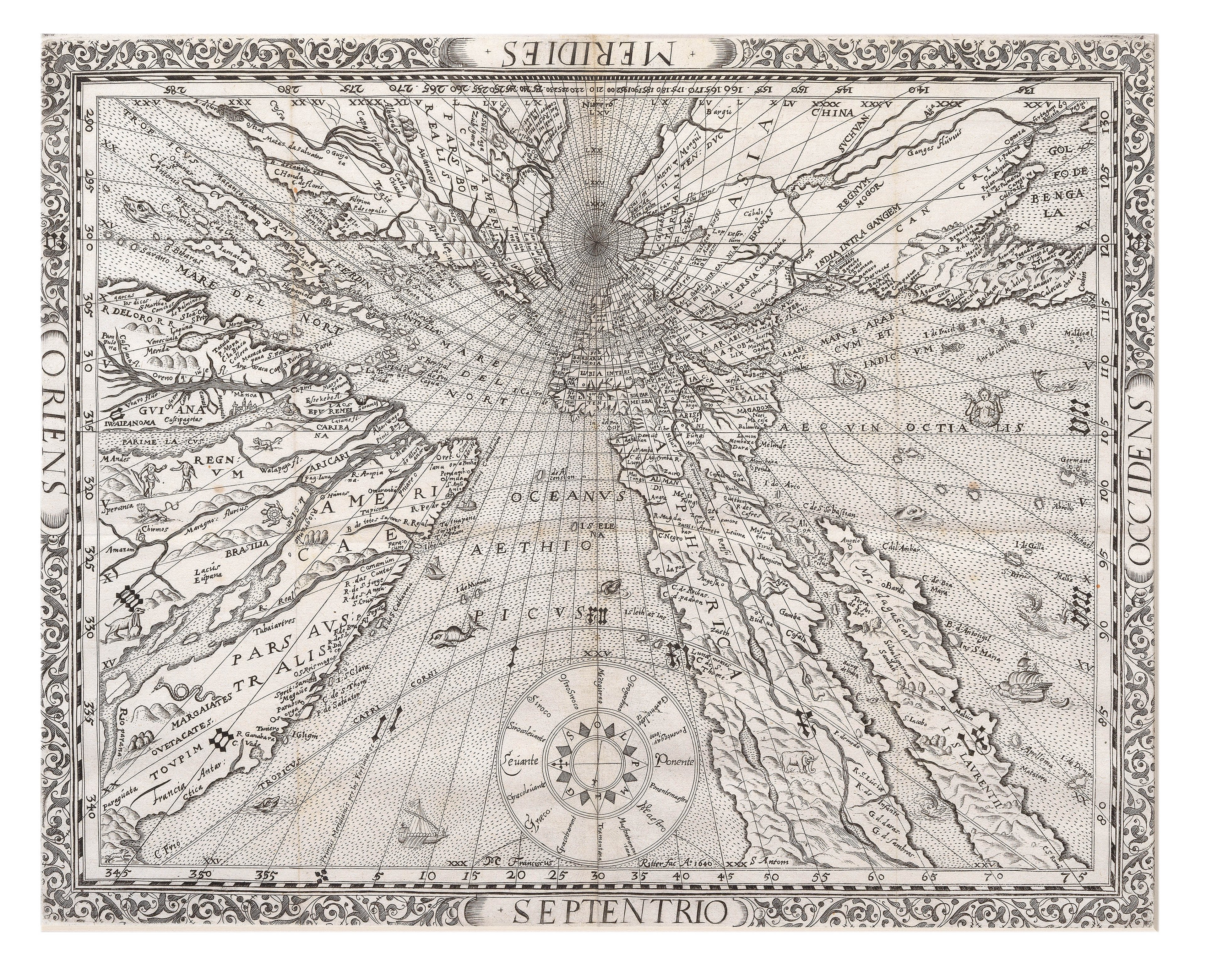
Gnomonic (Sundial)
This projection straightens the lines of the globe andplaces a great circle line, such as the equator, around the centre of the globe. As a result, the Earth is sliced into segments from one point. Distortion increases towards the edge of the map. It is one of the oldest map projections, dating back to the 6th century BCE.

They come in a range of variations, which can look very different. For example, a gnomonic polar projection represents the Earth as a flat disk with the poles as central points. A particularly unusual use of this projection is Franz Ritter’s 'Sundial Map' of 1640.

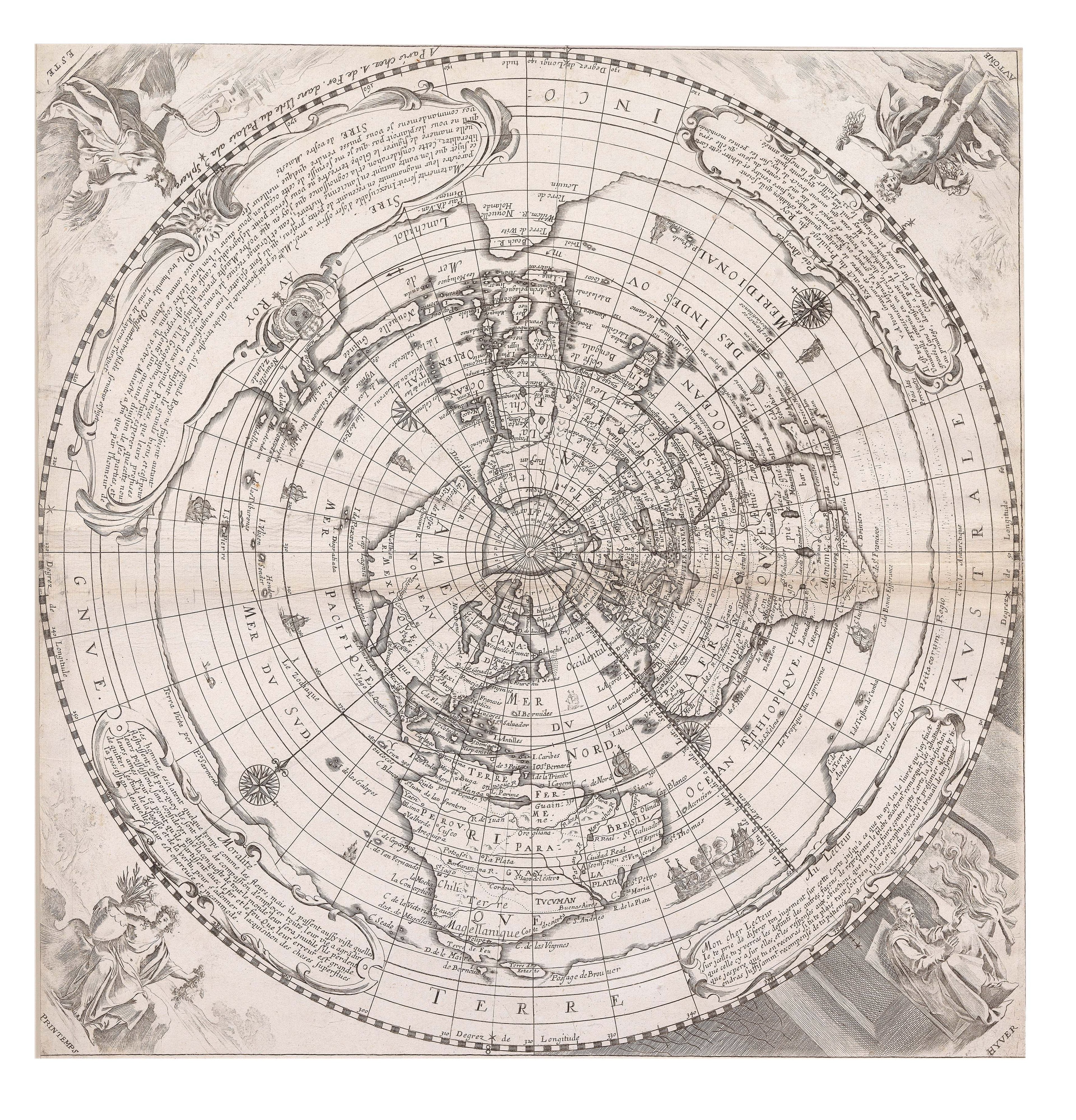
Polar or Azimuthal
Azimuthal projections are typically maps centred on the North and South Poles. Polar maps are usually disks with central points. The lines of latitude appear as concentric circles, equally distanced from one another, whilst the lines of latitude diverge at an angle. An azimuthal projection is useful as it provides the reader with a sense of the Earth’s spherical shape. Landmasses towards the edge of the map become more oblique, suggesting the curve of the globe.
This projection was most likely invented by the Persian mathematician al-Biruni in the 11th century. However, in Europe is it often known as the Postel projection, after the mapmaker Guillaume Postel, who used it in 1581. The azimuthal projection comes in a variety of types.
Conic
A conic projection involves unfurling the Earth onto a flat plane, as though it were the curved face of a cone. The projection is least distorted and stretched at the Equator. Lines of latitude are parallel concentric rings, whereas lines of longitude project outwards and meet at the central point.
In 1507, Johann Ruysch produced an unusual, fan-shaped map of the world using a conic projection. It was included in his 1507 edition of Ptolemy’s Geographia.
However, due to the distortions they cause, conic projections are not very useful in practice.