Bill Rankin
Series 5 Episode 5
Fight for your Right to Map! Radical Cartography with Bill Rankin
Series 5 Episode 5
Available on all major podcast platforms: click the icons or hit 'play' to listen now.
Jerry meets Bill Rankin, a cartographer, author and professor of history at Yale University.
In this episode of What’s Your Map? they discuss not one but two fascinating infographic maps that feature in Bill’s latest book Radical Cartography: What Maps Tell Us About Who We Are (2025, Pan Macmillan).
Radical cartography uses the method of mapmaking as a tool to challenge and educate on social, cultural, and political affairs. Maps are notoriously subjective and contain the deliberate choices of the cartographer about what is included and what - or who - is left out. Radical maps are thematic maps that aim to give agency to the people who are represented within them and better show the nuanced world we live in.
The first map was designed by activist Gwendolyn Warren in 1971. Titled ‘Where Commuters Run Over Black Children on the Pointes-Downtown Track’, it chronicles racial inequalities in a neighbourhood in East Detroit that previously went unrecognised.
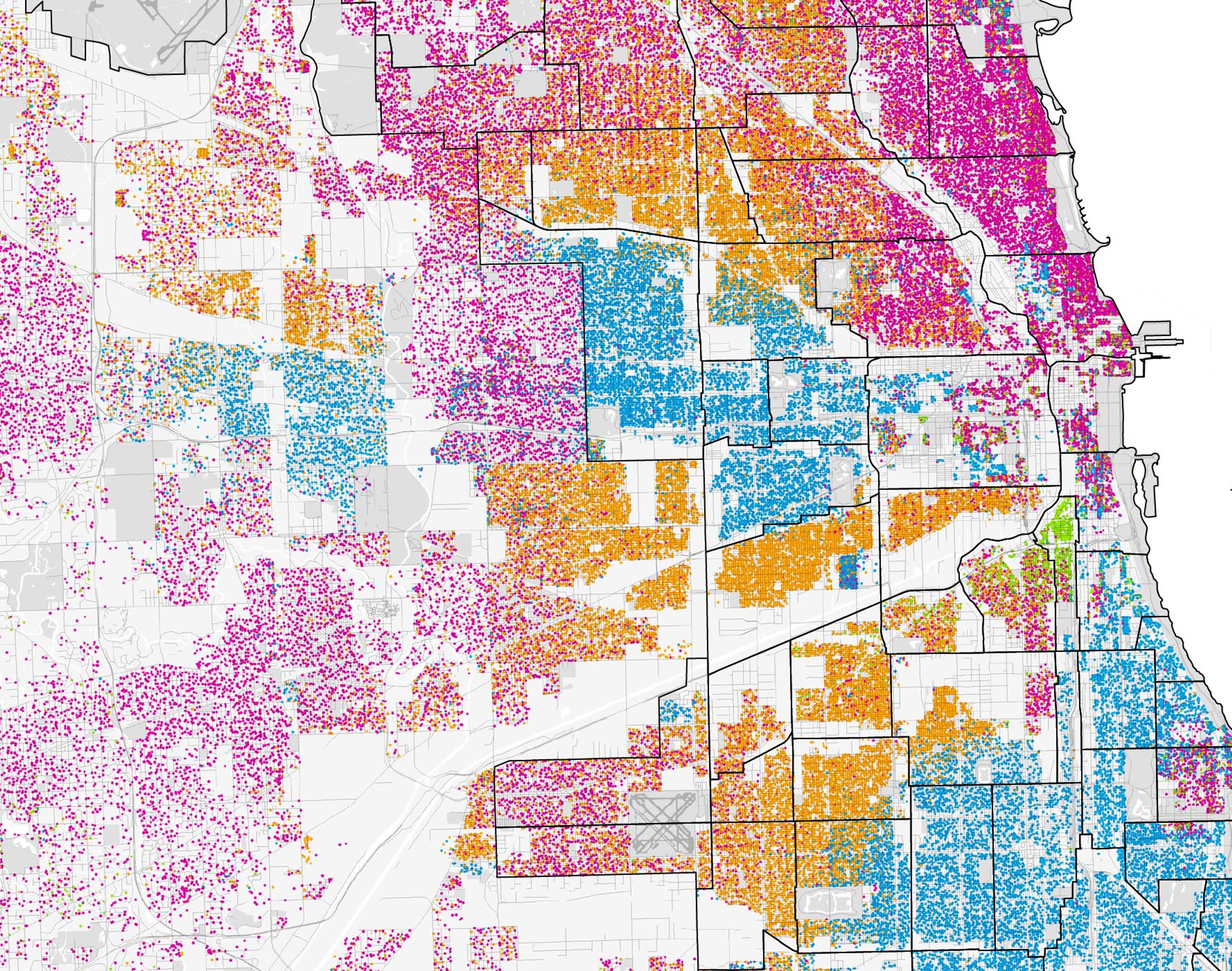
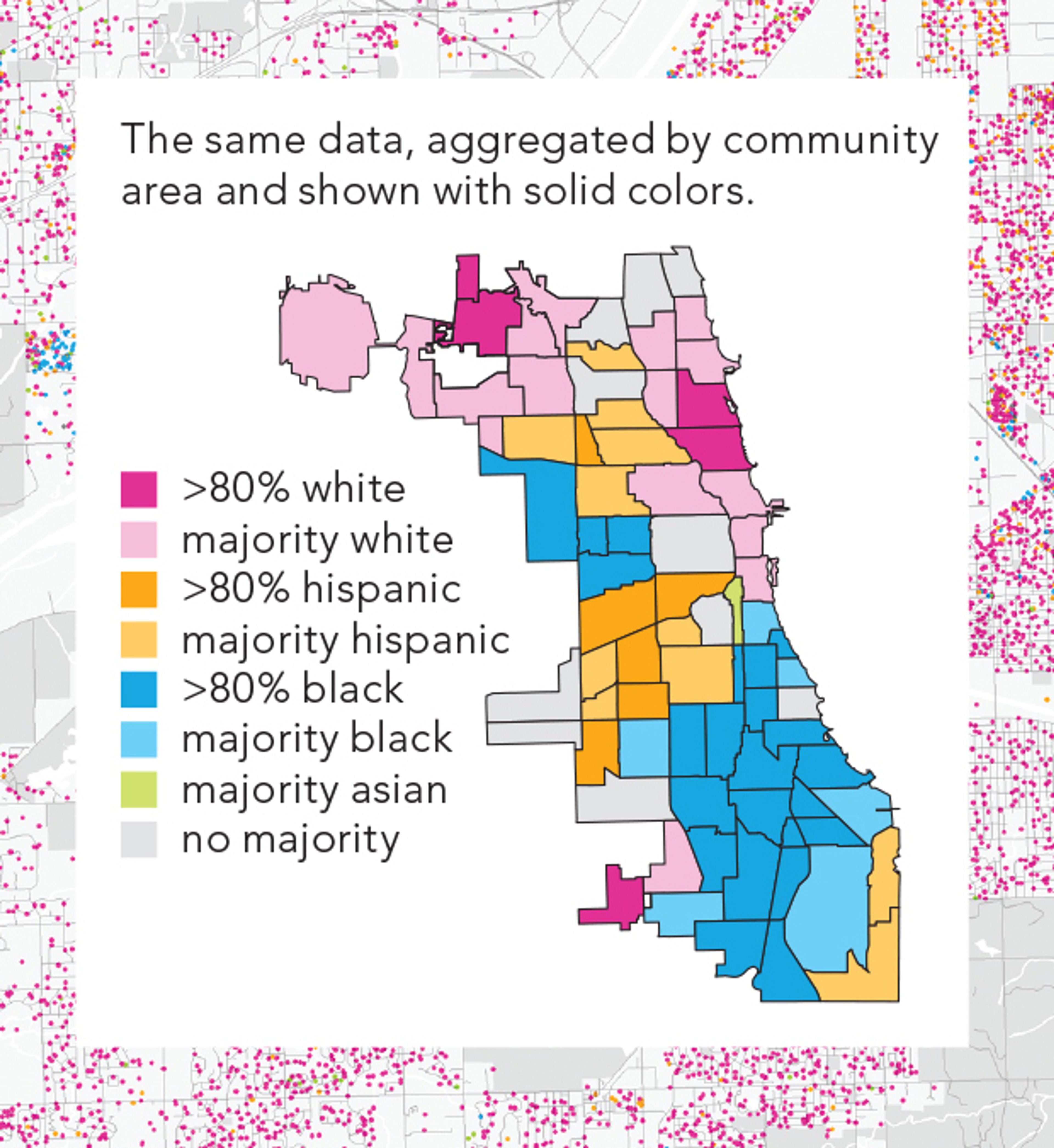
The second map, made by Bill, is titled ‘A Taxonomy of Transitions’ and shows the ethnography of Chicago in 2010 according to US census surveys. It harnesses the power of infographics to improve legibility, representation and create a boundary-less community.
To explore the maps while you listen, click the images below:
‘Where Commuters Run Over Black Children on the Pointes-Downtown Track’ 1971 ©Gwendolyn Warren
This map shows a Black neighbourhood in Detroit, roughly four miles wide, in between Downtown (west) and the wealthier, predominantly white suburbs of Grosse Pointe (east). Running in parallel in the upper portion of the map, Mack Avenue, Charlevoix Street, East Vernor Highway, Kerchaval Street and East Jefferson Avenue are marked. Commuters used these east-west routes as alternatives to bypass the heavy traffic on the main highway located just north of the area shown on the map.
This simple 1971 map reveals a distressing trend; it documents the fatalities of Black children in East Detroit at the hands of drivers traveling from the affluent, largely-white suburb through the segregated inner-city neighbourhood on their way Downtown. Circular icons have been used to pinpoint the locations of ‘accidents’. This map shows 196 accidents.
The evocative title and visual evidence on the map highlights the profound systemic inequality, where local children were exposed to severe traffic risks within their own communities. The people who lived along the route long knew of the danger, but it took the data to be collected and visualised like this for people to take it more seriously. As Bill and Jerry discuss, it also illustrates American urbanism in late 1960s-1970s and what is colloquially known as ‘white flight’ - where richer, predominantly white commuters moved out to the suburbs.
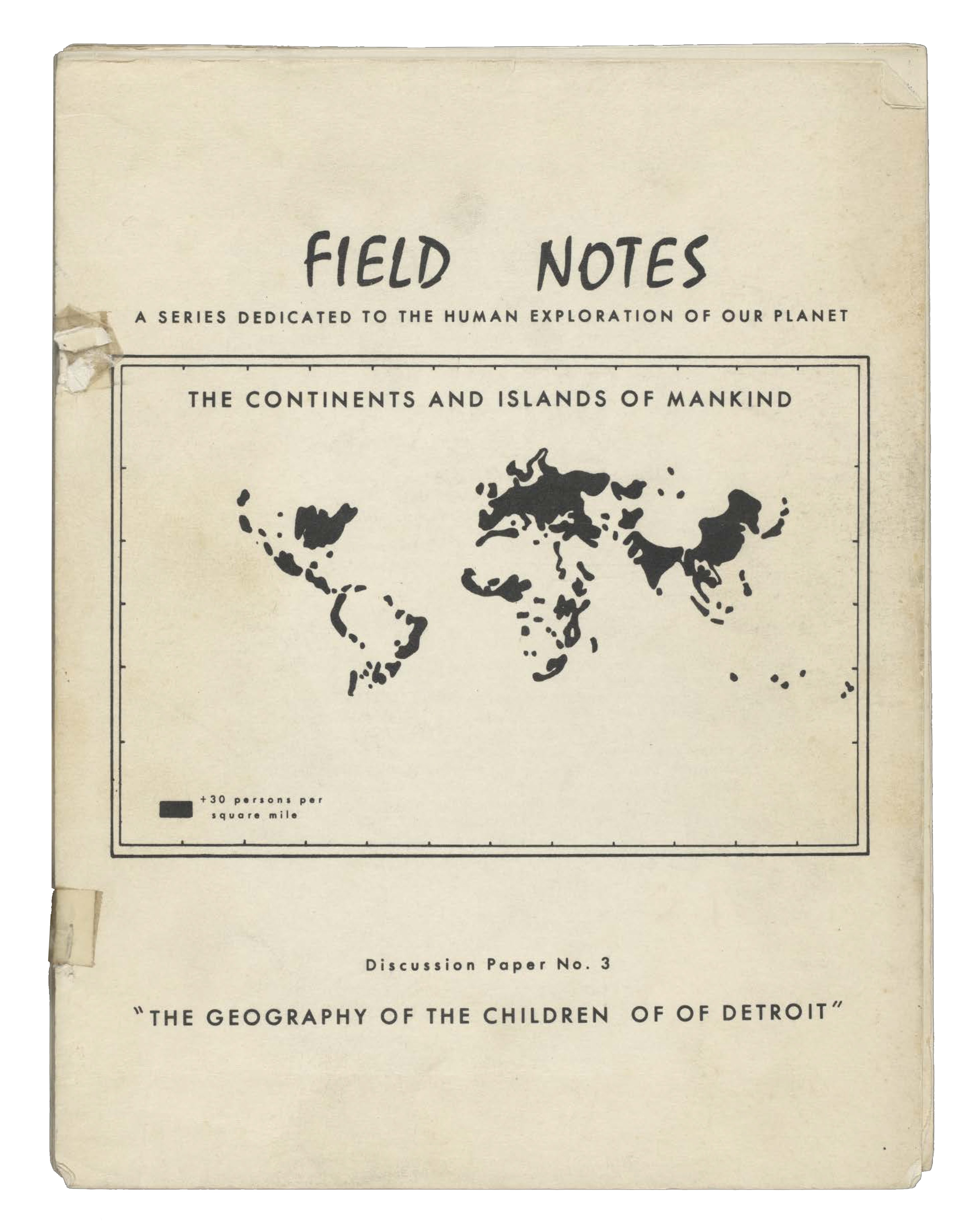
Cover for ‘Field Notes. Discussion Paper No. 3: The Geography of the Children of Detroit’ by Gwendolyn Warren. (1971, Detroit Geographical Expedition and Institute).
The map was published in a limited-run, typewritten journal titled ‘Field Notes: Discussion Paper No. 3: The Geography of the Children of Detroit’ released by the Detroit Geographic Expedition and Institute (DGEI). Founded in 1968, DGEI was a pioneering initiative that explored the health, safety, and lived experiences of people living in the city. The Expedition was formed a year after the deadly 1967 Detroit Uprising which remains one of the most destructive race riots in U.S. history.
Authored by activist-geographers Bill Bunge and Gwendolyn Warren, the map was accompanied by qualitative data in the form of personal accounts and ethnographic interviews, and other maps illustrating the inequities in transportation, commuting, working patterns, access and more. It aimed to demonstrate that ‘Detroit’s urban planning and transportation is inadequate and unjust for the Black community.’ You can find out more about this document here.
Bill Bunge is hailed as a pioneer of radical cartography and is often credited for this map. However, as Bill tells Jerry, the true architect of the map was Gwendolyn Warren and it was her personal connection to the area that drew attention to it. She developed the work in partnership with local Black youth and academic geographers.
Gwendolyn Warren is a distinguished public sector administrator, activist and cartographer. She has spent over 35 years leading government health, social and community services across the US. Her dedication to mapping and applying spatial thinking has significantly improved lives and opportunities for countless individuals.
She is known as being a ‘trailblazer in community-based and collaborative mapping for change.’ Her career has been spent devising and implementing initiatives to assist individuals with improving their lives, accessing necessary services, amplifying their voices, and nurturing sustainable and safe neighbourhoods.
Her journey started at just eighteen. When this map was made by Gwendolyn Warren was a young activist fighting against segregation in Detroit, she and Bunge were collaborators and community organisers. Together they established the Detroit Geographical Expedition and Institute, an extraordinary project of community-based and collaborative radical geography research and education. The mission of the DGEI was to use participatory mapping to expose racial injustice, advocate for residents, and improve environments.
Under Gwendolyn’s leadership, the DGEI trained hundreds of young people in applied geography, providing them with the skills to document and map their own dynamic communities in Detroit. In 2025, her lifelong commitment to using mapping for social change was honoured with the AAG Honorary Geographer Award.
Gwendolyn's scrutiny of data representation inspired Bill; he considers this map a premier example of radical cartography - and it is the first map featured in his 2025 book, ‘Radical Cartography.’
The map acted as a catalyst for Bill as an architect-come-cartographer, encouraging him to evolve from a mapmaker that wanted to create aesthetically pleasing, well-designed maps, to a mapmaker that shines a light on what the data shows, and importantly what it doesn’t. Bill now redraws and challenges conventional maps as a leading figure in the field.
‘A Taxonomy of Transitions’ 2010 ©Bill Rankin. An interactive version of this map can be found on Bill’s website radicalcartography.net
‘A Taxonomy of Transitions’ is a demographic breakdown of Chicago, Illinois -Bill’s home city. For this he utilised the 2010 U.S. Census self-identification data about ethnicity and race to illustrate the city's complex social fabric. By employing a dot-mapping technique (where each coloured dot represents twenty-five people) he was able to visualise distinct of urban transitions.
The mapping project originated when a suburban teacher was preparing to introduce eighth-grade students to Alex Kotlowitz’s ‘There Are No Children Here: The Story of Two Boys Growing Up in the Other America’ (1992). This nonfiction book provides a poignant account of two boys living in a notorious West Side housing project. This was a book that Bill was familiar with having had had to study it himself in high school, and remembers it being a tricky read.
The teacher was concerned that his students might struggle to understand the forces that placed children of the same age into an environment overwhelmed by violence, addiction, and unemployment. So, in an effort to help them comprehend their lived differences, the teacher tasked them with create a series of infographic maps depicting a wide array of data to highlight how different forms of social exclusion intersect.
Seeking a more comprehensive visualisation, the teacher commissioned Bill to create a coherent ethnographic map that could capture the subtle complexities of the city's neighbourhoods that challenges the more informational or political maps. Bill found when he used dot mapping he was able to visualise the demographics as both reinforcing and blurring those boundaries usually found on informational and political maps to create a much more human geography.
As Bill writes in his book, “Radical cartography instead shows a geography that’s messier and lumpier, with more overlaps and internal diversity, burdened by the weight of history. […] At its best, radical cartography shows a world that matches our understanding and our experience - not just our expectations of what a map should look like.”
About Bill Rankin

Bill Rankin is an Associate Professor of history at Yale University, where he focuses on the history of mapping and the geographic sciences.
Born and raised outside Chicago, he was originally trained as an architect before receiving a dual PhD in the History of Science and Architecture from Harvard University.
In addition to his work as a historian, he is also an award-winning cartographer, and his maps - available at radicalcartography.net - have appeared in numerous books, magazines, and exhibits around the world.
Why not continue your exploration of the wonderful world of maps by subscribing to the podcast? That way you will never miss an episode.
Feel free to let us know - What's YOUR Map?!
All views and opinions expressed by guests on the podcast are entirely their own and do not represent those of The Sunderland Collection or Whistledown Productions.